

Modern internet users browse websites using smartphones, tablets, laptops, desktops, smart TVs, and many other
connected devices. Because screen sizes vary dramatically, developers must create websites that automatically
adapt to different resolutions and viewing environments. This is where responsive web design becomes one of the
most important skills in modern front-end development.
A strong css responsive design strategy ensures that visitors enjoy a smooth and consistent
experience regardless of the device they use. Instead of building separate desktop and mobile websites,
responsive design allows a single website to adapt dynamically using flexible layouts, media queries, scalable
images, and mobile-friendly navigation systems.
Search engines also prioritize mobile-friendly websites. As mobile traffic continues to dominate the internet,
responsive websites often perform better in search results while providing improved usability and engagement.
In this detailed guide, you will learn seven powerful mobile tricks that professional developers use to create
responsive websites. You will also discover practical examples, optimization techniques, and best practices that
can help improve user experience and website performance.
What Is Responsive Web Design?
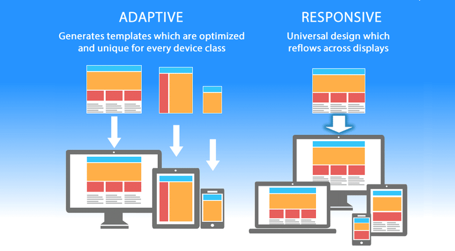
Responsive web design is a development approach that allows a website’s layout and content to adjust
automatically according to the size of the user’s screen. Instead of creating multiple versions of a website,
developers build one flexible layout that responds to various devices.
The primary goal of responsive design is to provide readability, accessibility, and usability across all screen
sizes without forcing users to zoom or scroll horizontally.
A properly implemented css responsive design approach combines flexible grids, scalable media,
responsive typography, and media queries to create adaptable interfaces.
Why Mobile-First Design Matters
Mobile-first design is a strategy where developers create layouts for smaller screens before enhancing them for
larger devices. This method encourages simplicity, efficiency, and better performance.
Since most internet traffic now comes from mobile devices, prioritizing mobile experiences helps businesses
reach a broader audience and improve customer satisfaction.
- Improved user experience
- Faster page loading
- Better search rankings
- Higher engagement rates
- Reduced bounce rates
- Simplified design process
Organizations that prioritize mobile optimization often achieve stronger online performance and improved
conversion rates.
Trick #1: Use Fluid Layouts Instead of Fixed Widths
One of the most effective responsive design techniques involves replacing fixed pixel-based layouts with fluid
percentage-based layouts. Fixed layouts often break on smaller screens, while fluid layouts adapt naturally to
available space.
Fluid layouts allow content to resize proportionally as screen dimensions change.
width: 90%;
margin: auto;
}
In this example, the container automatically adjusts according to the available screen width while maintaining
consistent spacing.
A professional css responsive design implementation typically uses percentages, viewport units,
and modern layout systems instead of rigid dimensions.
Example 1: Business Website Layout
A business homepage using percentage-based containers can scale effectively from smartphones to large desktop
monitors without losing readability.
Example 2: Blog Content Area
A blog layout can use fluid widths to ensure articles remain comfortable to read across different devices.
Benefits of Fluid Layouts
- Improved flexibility
- Better device compatibility
- Reduced maintenance
- Enhanced readability
- Future-proof design structure
Fluid layouts form the foundation of modern responsive websites and are widely used by professional developers.
Trick #2: Master CSS Media Queries
Media queries allow developers to apply different styles based on screen size, device orientation, resolution,
and other characteristics. They are one of the most important tools in responsive web development.
Media queries enable layouts to adapt intelligently as devices change.
.menu {
display: none;
}
}
This example hides navigation elements when the screen width falls below a specified threshold.
Every advanced css responsive design project relies heavily on media queries to ensure
consistent user experiences.
Example 3: Mobile Navigation Menu
Navigation systems can transform into mobile-friendly menus when screen sizes become smaller.
Example 4: Responsive Product Grid
An eCommerce product grid can display four columns on desktops, two columns on tablets, and a single column on
mobile devices.
Common Media Query Breakpoints
- 576px for small devices
- 768px for tablets
- 992px for laptops
- 1200px for desktops
- 1400px for large screens
While breakpoints vary by project, these ranges provide a useful starting point for responsive development.
Trick #3: Create Flexible Typography
Typography plays a major role in readability and user experience. Text that appears perfect on desktop screens
may become difficult to read on mobile devices if not properly optimized.
Flexible typography ensures text scales appropriately across various screen sizes while maintaining readability
and visual balance.
font-size: clamp(
2rem,
5vw,
4rem
);
}
The clamp() function enables responsive font scaling without requiring multiple media queries.
An effective css responsive design strategy includes typography systems that adapt smoothly to
changing viewport dimensions.
- Improved readability
- Better accessibility
- Enhanced visual hierarchy
- Reduced layout issues
- Improved mobile experience
Responsive typography contributes significantly to user satisfaction and content engagement.
Trick #4: Master CSS Flexbox for Mobile Layouts
Flexbox is one of the most powerful layout systems available in modern CSS. It allows developers to align,
distribute, and organize content efficiently without relying on complicated positioning methods.
When building mobile-friendly websites, Flexbox simplifies responsive layouts and reduces the amount of code
required to achieve professional results.
A well-planned css responsive design strategy often uses Flexbox to create adaptable navigation
bars, content sections, pricing tables, and feature grids.
display: flex;
flex-wrap: wrap;
gap: 20px;
}
The flex-wrap property allows elements to move onto new lines when screen space becomes limited.
Example 5: Responsive Feature Section
A business website can use Flexbox to display service features in multiple columns on desktop devices and
automatically stack them vertically on mobile screens.
Benefits of Flexbox
- Easy alignment control
- Responsive content distribution
- Reduced layout complexity
- Improved mobile compatibility
- Cleaner CSS structure
Trick #5: Use CSS Grid for Advanced Responsive Layouts
While Flexbox works exceptionally well for one-dimensional layouts, CSS Grid provides greater control for
two-dimensional page structures. Grid enables developers to manage rows and columns simultaneously.
Modern websites often combine Grid and Flexbox to achieve highly flexible and maintainable layouts.
display: grid;
grid-template-columns:
repeat(auto-fit,
minmax(250px, 1fr));
gap: 20px;
}
This code automatically adjusts the number of columns based on available screen space.
Professional css responsive design implementations frequently rely on Grid to create dynamic
layouts that scale beautifully across devices.
Example 6: Responsive Portfolio Gallery
A portfolio website can use CSS Grid to display projects in multiple columns on larger screens while
automatically reorganizing them for smaller devices.
Advantages of CSS Grid
- Powerful layout control
- Automatic responsiveness
- Reduced media query usage
- Flexible content arrangement
- Improved maintainability
Trick #6: Optimize Responsive Images
Images often account for the largest portion of page size. If images are not optimized, websites can become slow
and difficult to use on mobile networks.
Responsive images help deliver the appropriate image size for different devices, improving performance and user
experience.
max-width: 100%;
height: auto;
}
This simple rule prevents images from overflowing their containers and ensures they scale proportionally.
Every effective css responsive design workflow includes image optimization because mobile users
expect fast-loading pages.
Example 7: E-Commerce Product Images
Online stores can serve optimized product images that maintain quality while reducing loading times on
smartphones and tablets.
Image Optimization Best Practices
- Use modern image formats
- Compress large files
- Implement lazy loading
- Avoid oversized images
- Use responsive image techniques
Trick #7: Improve Mobile Navigation
Navigation is one of the most important aspects of user experience. Menus that work well on desktop screens
often become difficult to use on mobile devices.
Mobile navigation should remain simple, accessible, and easy to interact with using touch controls.
display: block;
}
.navigation {
display: none;
}
Developers commonly use toggle buttons to reveal navigation menus on smaller screens.
A professional css responsive design approach ensures navigation remains intuitive regardless
of device size.
Example 8: Mobile Hamburger Menu
A responsive navigation system can collapse into a hamburger menu on smartphones while remaining fully visible
on desktop devices.
Common Responsive Design Mistakes
Even experienced developers occasionally encounter challenges when building responsive websites. Understanding
common mistakes helps prevent usability and performance issues.
- Using fixed widths everywhere
- Ignoring mobile testing
- Oversized images
- Tiny touch targets
- Poor typography scaling
- Excessive media queries
- Unoptimized layouts
Avoiding these issues significantly improves the quality and effectiveness of responsive websites.
Performance Optimization for Mobile Devices
Performance directly affects user satisfaction, search rankings, and conversion rates. Mobile users are
particularly sensitive to slow-loading websites.
Fast websites create better experiences and encourage users to remain engaged with content.
- Minify CSS files
- Reduce unnecessary code
- Enable browser caching
- Optimize fonts
- Compress images
- Limit third-party scripts
- Use content delivery networks
Successful css responsive design projects balance visual quality, usability, and performance to
deliver the best possible user experience.
Testing Responsive Websites Effectively
Responsive development does not end after writing code. Thorough testing ensures layouts behave correctly across
multiple devices, browsers, and operating systems.
- Test on smartphones
- Test on tablets
- Test on desktops
- Check landscape orientation
- Verify touch interactions
- Review browser compatibility
Consistent testing helps identify issues before they affect real users and improves overall website quality.
Example 9: Responsive News Website
News websites publish large amounts of content every day and attract visitors from a wide variety of devices. A
responsive layout ensures articles remain readable whether users access content from smartphones, tablets, or
desktop computers.
A well-structured css responsive design implementation can automatically adjust article
layouts, image sizes, typography, and navigation elements based on screen dimensions.
display: grid;
grid-template-columns:
2fr 1fr;
gap: 20px;
}
On smaller screens, the layout can collapse into a single-column structure, improving readability and usability.
Example 10: Responsive Online Learning Platform
Educational websites often contain videos, lessons, quizzes, and interactive content. Responsive design ensures
learners can access course materials comfortably from any device.
Mobile-friendly learning platforms increase accessibility and encourage higher engagement among students.
width: 100%;
overflow: hidden;
}
Responsive video containers help maintain proper proportions while adapting to various screen sizes.
Responsive Design Workflow
Professional developers typically follow a structured workflow when building responsive websites. This process
improves consistency and reduces development errors.
- Define project requirements
- Create wireframes
- Design mobile layouts first
- Develop responsive components
- Apply media queries
- Optimize performance
- Test across devices
- Launch and monitor results
A systematic workflow helps teams deliver high-quality responsive experiences efficiently.
Every successful css responsive design project benefits from planning and thorough testing
throughout the development lifecycle.
SEO Benefits of Responsive Websites
Responsive websites provide several search engine optimization advantages. Search engines prioritize user
experience, and mobile-friendly websites often perform better in rankings.
- Improved mobile usability
- Lower bounce rates
- Better page experience signals
- Simplified site management
- Consistent URL structure
- Enhanced user engagement
- Improved crawl efficiency
A properly optimized css responsive design strategy contributes to both user satisfaction and
search visibility.
Accessibility and Responsive Design
Accessibility ensures websites remain usable for people with diverse abilities. Responsive design and
accessibility often work together to improve overall user experiences.
- Use readable font sizes
- Maintain strong color contrast
- Provide keyboard navigation
- Support screen readers
- Create accessible forms
- Use meaningful headings
Combining accessibility standards with responsive techniques results in websites that serve a broader audience.
Future Trends in Responsive Web Design
The web continues to evolve, and responsive design practices are advancing alongside new technologies and
devices.
Developers who stay informed about emerging trends can build more adaptable and future-ready websites.
- Container queries
- Advanced CSS Grid features
- Progressive web applications
- Responsive typography systems
- Adaptive user interfaces
- Performance-focused development
- Cross-device experiences
Modern css responsive design approaches increasingly focus on flexibility, performance, and
user-centered experiences.
Responsive Design Best Practices Checklist
Before launching a website, developers should verify that essential responsive design principles have been
implemented successfully.
- Use fluid layouts
- Implement media queries wisely
- Optimize typography
- Compress images
- Test navigation on mobile devices
- Verify browser compatibility
- Improve page loading speed
- Ensure accessibility compliance
- Test multiple screen sizes
- Monitor performance after launch
Following this checklist helps create professional websites that perform consistently across different
environments.
Business Advantages of Mobile Optimization
Responsive websites provide measurable business benefits. Organizations that prioritize mobile experiences often
achieve stronger engagement and higher conversion rates.
- Increased customer satisfaction
- Higher conversion rates
- Improved search visibility
- Reduced maintenance costs
- Better brand perception
- Greater audience reach
An effective css responsive design implementation supports both technical and business
objectives.
Conclusion
Responsive web design has become an essential part of modern website development. With users accessing content
from countless devices and screen sizes, creating adaptable interfaces is no longer optional.
In this guide, we explored seven powerful mobile tricks including fluid layouts, media queries, responsive
typography, Flexbox, CSS Grid, responsive images, and mobile navigation optimization. Together, these techniques
help developers create websites that look professional and function effectively across all devices.
A successful css responsive design strategy balances usability, performance, accessibility, and
maintainability. Developers who master these principles can build websites that satisfy users while supporting
business goals.
As technology continues to evolve, responsive design will remain a critical skill for front-end developers.
Investing time in mastering these techniques today will help create better digital experiences for years to
come.
Frequently Asked Questions (FAQs)
1. What is CSS Responsive Design?
CSS Responsive Design is a web development approach that enables websites to adapt automatically to different
screen sizes and devices.
2. Why is responsive design important?
Responsive design improves user experience, accessibility, and search engine visibility while supporting
multiple devices.
3. What are media queries?
Media queries allow developers to apply different styles based on screen size, resolution, and device
characteristics.
4. What is mobile-first design?
Mobile-first design starts with layouts for smaller screens before enhancing them for larger devices.
5. How does Flexbox help responsive design?
Flexbox simplifies content alignment and layout adaptation across different screen sizes.
6. What is CSS Grid used for?
CSS Grid helps create advanced two-dimensional layouts with flexible rows and columns.
7. Why are responsive images important?
Responsive images improve performance and ensure media displays correctly on different devices.
8. How can I test responsive websites?
You can test responsive websites using browser developer tools, physical devices, and online testing platforms.
9. Does responsive design affect SEO?
Yes. Mobile-friendly websites often perform better in search rankings because they provide better user
experiences.
10. What is the best way to learn responsive design?
Practice building real projects using media queries, Flexbox, CSS Grid, responsive images, and mobile-first
development techniques.