
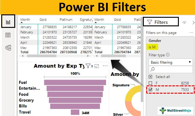

Introduction
Modern organizations generate massive amounts of data every day. From sales records and customer interactions to website traffic and operational metrics, data is constantly growing. The challenge is not collecting information anymore—it is finding meaningful insights quickly.
Microsoft Power BI has become one of the most trusted business intelligence platforms because it transforms raw data into interactive visual reports. One of its most valuable capabilities is the ability to narrow down information using Power BI Filters. Instead of overwhelming users with thousands of rows of data, filters help focus attention on specific metrics, departments, regions, products, or time periods.
Business analysts use filtering techniques every day to answer critical questions. Which products generated the highest revenue? Which region experienced declining sales? Which marketing campaign delivered the best return on investment? Filters provide immediate answers by reducing noise and highlighting relevant information.
When combined with power bi slicers, power bi reports, and a well-designed power bi dashboard, filtering capabilities become even more powerful. Interactive reports allow executives, managers, and analysts to make faster and smarter decisions without requiring advanced technical knowledge.
In this guide, you will learn how analysts use Power BI Filters to simplify reporting, improve dashboard usability, and uncover actionable insights. We will also explore practical examples and best practices that can immediately improve your reporting workflow.
What Are Power BI Filters?
Filters are tools that limit the data displayed in a report, visual, page, or dashboard. Instead of showing all available records, filters display only the information that matches specific criteria.
For example, if a company operates globally, a report may contain sales data from dozens of countries. Applying a country filter allows users to view information for only one market, making analysis significantly easier.
Analysts frequently rely on Power BI Filters because they improve readability, increase report performance, and help users focus on the information that matters most.
- Reduce information overload
- Improve report usability
- Support faster decision-making
- Enable interactive exploration
- Enhance dashboard performance
Without effective filtering, dashboards often become cluttered and difficult to interpret. Proper filter implementation ensures every report remains focused and actionable.
Understanding Filter Levels in Power BI
Power BI provides multiple filtering levels, allowing analysts to control exactly where filters are applied. Understanding these levels is essential for creating professional reports.
1. Visual-Level Filters
Visual-level filters affect only a single chart, table, card, or graph. They are useful when a visual should display information differently from the rest of the report.
Sales Chart → Show only Top 10 Products
Other visuals → Display all products
2. Page-Level Filters
Page-level filters apply to every visual on a specific report page. Analysts often use them to create department-specific or region-specific report views.
Region = North America
All visuals on the page
automatically display
North America data only.
3. Report-Level Filters
Report-level filters affect every page inside the report. This ensures consistency across multiple pages and visualizations.
Year = 2026
All report pages
display only 2026 data.
Many organizations implement Power BI Filters at the report level to maintain consistency while reducing repetitive filter configurations.
Trick #1: Use Relative Date Filters for Dynamic Reporting
One of the most popular filtering techniques among analysts is the relative date filter. Instead of manually selecting date ranges, relative filters automatically adjust based on the current date.
This approach ensures reports always remain current without requiring manual updates.
Benefits of Relative Date Filters
- Automatically updates data
- Reduces maintenance effort
- Supports real-time analysis
- Improves dashboard accuracy
- Enhances executive reporting
Example 1: Last 30 Days Sales Analysis
A retail company wants to track recent sales activity. Instead of selecting specific dates each month, analysts configure a relative filter showing the last 30 days.
Date
Condition:
Last 30 Days
Whenever users open the report, the dashboard automatically updates to display the latest thirty-day period.
Example 2: Last 12 Months Revenue Tracking
Finance teams often monitor yearly performance using rolling periods. A relative date filter can display revenue for the previous twelve months, providing a continuously updated view.
Last 12 Months
Measure:
Total Revenue
This method eliminates the need to edit reports at the beginning of every new year.
Trick #2: Combine Filters with Slicers for Better User Experience
Many beginners confuse filters and slicers. While both control displayed data, slicers provide an interactive visual interface directly on the report page.
Experienced analysts frequently combine Power BI Filters with slicers to create highly interactive dashboards that business users can explore independently.
Advantages of Combining Filters and Slicers
- Improves user engagement
- Reduces report complexity
- Supports self-service analytics
- Makes reports easier to understand
- Enhances dashboard navigation
Example 3: Regional Sales Dashboard
A sales dashboard includes a region slicer. Users select North, South, East, or West regions, and every visual updates instantly.
Region
Options:
North
South
East
West
This creates a user-friendly reporting experience without requiring report modifications.
Example 4: Product Category Analysis
An e-commerce business allows managers to choose product categories using a slicer. Combined with page-level filters, managers can quickly evaluate category performance and identify growth opportunities.
Electronics
Fashion
Home
Sports
Books
The combination of slicers and filters is one of the most effective methods for improving power bi reports because it gives users greater control over the information displayed.
Why Analysts Depend on Filtering Techniques Daily
Business intelligence professionals work with complex datasets containing millions of records. Reviewing raw information manually is often impossible. Filtering techniques simplify analysis by narrowing datasets into meaningful segments.
Analysts use Power BI Filters to investigate trends, identify outliers, compare performance metrics, and generate actionable insights. Whether monitoring sales, finance, marketing, operations, or customer service data, filtering remains one of the most frequently used capabilities inside Power BI.
Organizations that implement strong filtering strategies often experience faster reporting cycles, improved data accuracy, and better decision-making outcomes.
Trick #3: Apply Top N Filters to Highlight Key Performers
One of the most valuable techniques analysts use is focusing attention on the highest-performing records. Large datasets often contain hundreds or thousands of products, customers, or regions. Displaying all records can overwhelm users and hide important insights.
Using Power BI Filters with Top N functionality allows analysts to automatically display only the best-performing items based on a selected measure such as revenue, profit, quantity sold, or customer count.
This technique is especially useful in executive dashboards where decision-makers need quick visibility into top contributors without scrolling through lengthy reports.
Benefits of Top N Filters
- Highlights top-performing products
- Simplifies dashboard visuals
- Improves executive reporting
- Focuses attention on important metrics
- Reduces clutter in charts and tables
Example 5: Top 10 Products by Revenue
A retail organization sells thousands of products. Management only wants to review the ten products generating the highest revenue.
Top N
Show:
Top 10 Products
By:
Revenue
The visual automatically updates whenever sales data changes, ensuring the highest-performing products remain visible.
Example 6: Top 5 Customers by Profit
A B2B company wants to identify its most profitable customers. Analysts use Top N filtering to display the top five customers ranked by profit contribution.
5
Measure:
Profit
Target:
Customer Name
This approach helps account managers focus their efforts on high-value relationships.
Trick #4: Use Advanced Filters for Precise Data Analysis
Sometimes business users require more detailed filtering conditions than simple selections. Advanced filters provide greater flexibility by allowing conditions such as greater than, less than, contains, begins with, or specific value ranges.
Experienced analysts rely on advanced filtering when investigating trends, identifying anomalies, and performing deep business analysis.
Common Advanced Filter Conditions
- Greater than
- Less than
- Contains
- Does not contain
- Starts with
- Ends with
- Between specific values
Example 7: Find High-Value Orders
A company wants to analyze only orders worth more than $10,000. An advanced filter helps isolate premium transactions for detailed review.
Condition:
Greater Than
10000
The report instantly removes smaller transactions and focuses exclusively on high-value business opportunities.
Example 8: Filter Customers by Name Pattern
Marketing teams sometimes need to locate customer groups that match a naming convention or business segment.
Condition:
Contains
“Tech”
Only customer records containing the selected keyword appear in the report, making segmentation significantly easier.
How Filters Improve Power BI Dashboard Performance
Performance is one of the most important factors in business intelligence. Users expect dashboards to load quickly and respond immediately when interacting with visuals. Poorly optimized reports can result in slow loading times and a frustrating user experience.
Applying Power BI Filters strategically reduces the amount of data processed by visuals. This decreases query execution time and improves dashboard responsiveness.
Many enterprise organizations handle millions of records. Loading every record simultaneously may consume significant system resources. Filtering reduces this burden and ensures smoother report performance.
Performance Benefits
- Faster report loading
- Reduced memory usage
- Improved visual responsiveness
- Better user experience
- More scalable reporting solutions
Best Practices for Designing Filter-Friendly Reports
Successful report design involves more than simply adding visuals. Analysts must carefully structure filters so users can navigate reports efficiently and find answers quickly.
The following best practices help create professional and user-friendly reports.
- Keep filter selections simple
- Avoid excessive filter combinations
- Use meaningful field names
- Group related filters together
- Test report performance regularly
- Provide default selections when possible
- Use slicers for commonly used fields
Reports designed with these principles typically achieve higher user adoption rates and require less training.
Common Types of Filters Used in Business Reporting
Analysts working with power bi reports commonly use several filter categories depending on business requirements.
Date Filters
Used for analyzing historical performance, monthly trends, quarterly results, and year-over-year comparisons.
Geographical Filters
Allow users to focus on countries, states, cities, territories, or sales regions.
Product Filters
Useful for evaluating product categories, brands, inventory groups, and individual product performance.
Customer Filters
Support customer segmentation, retention analysis, loyalty programs, and revenue contribution tracking.
Department Filters
Help organizations evaluate performance across finance, HR, operations, marketing, sales, and customer support departments.
Using Filters with DAX Measures
DAX (Data Analysis Expressions) is the calculation language used within Power BI. Analysts often combine filters with DAX measures to create highly dynamic reporting experiences.
For example, a measure may calculate revenue, profit margin, customer count, or average order value based on the currently selected filters.
SUM(Sales[Revenue])
When report users change filters, the DAX measure automatically recalculates results using the filtered dataset.
This dynamic interaction is one reason why Power BI Filters are considered fundamental to modern business intelligence reporting.
Common Mistakes Analysts Should Avoid
Even experienced professionals occasionally create filtering issues that negatively impact usability. Understanding these mistakes can help maintain report quality.
- Applying too many filters simultaneously
- Using unclear filter labels
- Ignoring report performance impacts
- Creating conflicting filter logic
- Overloading pages with unnecessary slicers
- Failing to test user interactions
- Not documenting report behavior
Avoiding these mistakes helps create cleaner dashboards and improves the overall reporting experience.
Power BI Dashboard Optimization Tips
Optimization plays a critical role when building enterprise-grade dashboards. Efficient filtering structures help maintain responsiveness while improving user satisfaction.
- Limit high-cardinality fields
- Reduce unnecessary visuals
- Use aggregations where possible
- Archive historical data when appropriate
- Optimize relationships between tables
- Minimize excessive cross-filtering
- Monitor performance using Performance Analyzer
Organizations that prioritize dashboard optimization often achieve faster report adoption and better business outcomes.
Whether building financial reports, operational dashboards, marketing analytics platforms, or executive scorecards, Power BI Filters remain one of the most effective tools for delivering accurate and actionable insights.