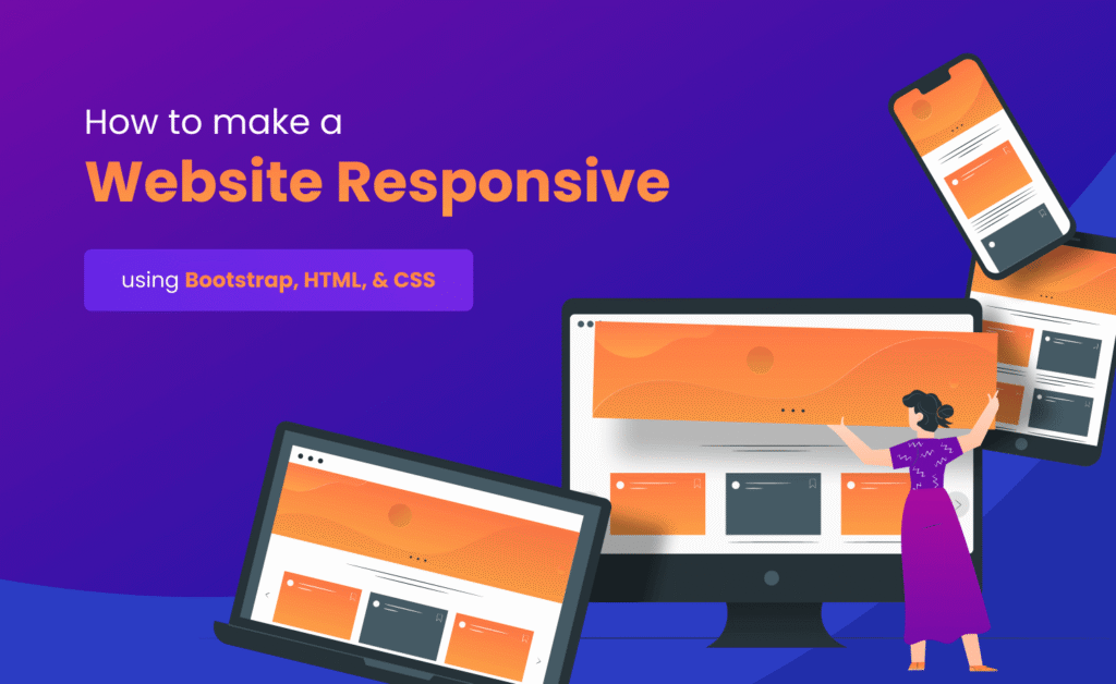
Modern websites must perform well on smartphones, tablets, laptops, and desktop computers. With mobile users accounting for the majority of internet traffic worldwide, responsive design is no longer optional. Businesses, bloggers, developers, and digital marketers all need websites that adapt seamlessly to different screen sizes. This is where bootstrap responsive development becomes incredibly valuable.
Bootstrap is one of the most popular frontend frameworks available today. It simplifies responsive web design by providing a powerful grid system, pre-built components, utility classes, and mobile-first development tools. Instead of writing hundreds of lines of custom CSS, developers can use Bootstrap to create professional layouts quickly and efficiently.
Whether you are building a personal blog, eCommerce store, portfolio website, or enterprise application, Bootstrap helps create visually appealing and user-friendly interfaces. Its responsive capabilities allow websites to look great across devices while maintaining performance and accessibility.
In this guide, you will discover seven powerful mobile optimization tricks, practical coding examples, and proven techniques that can improve responsiveness, usability, and overall website quality.
What is Bootstrap?
Bootstrap is an open-source frontend framework developed to simplify website design and development. It includes CSS styles, JavaScript components, responsive utilities, and a flexible grid system that helps developers create modern websites quickly.
The framework follows a mobile-first philosophy, meaning layouts are designed for smaller screens first and then enhanced for larger devices. This approach improves usability and aligns with modern web development standards.
Understanding bootstrap responsive principles is essential for developers who want to build websites that perform consistently across multiple devices.
Why Use Bootstrap for Responsive Design?
- Mobile-first architecture
- Flexible grid system
- Pre-built UI components
- Fast development process
- Cross-browser compatibility
- Extensive documentation
- Large developer community
- Easy customization options
These advantages make Bootstrap one of the most trusted frameworks for modern web development projects.
Tip 1: Master the Bootstrap Grid System
The Bootstrap grid system is the foundation of responsive layouts. It uses rows and columns to organize content and automatically adjusts layouts based on screen size.
A strong understanding of the grid system is one of the most important bootstrap responsive skills because nearly every layout depends on proper column structure.
Example 1: Basic Grid Layout
<div class="container">
  <div class="row">
    <div class="col-md-6">
      Left Column
    </div>

    <div class="col-md-6">
      Right Column
    </div>
  </div>
</div>
This layout displays two equal columns on medium and larger devices while automatically stacking them on smaller screens.
Tip 2: Use Mobile-First Breakpoints
Bootstrap includes predefined breakpoints that allow developers to create layouts for different device sizes. These breakpoints help optimize user experiences across smartphones, tablets, and desktops.
Bootstrap Breakpoints
- Extra Small (xs)
- Small (sm)
- Medium (md)
- Large (lg)
- Extra Large (xl)
- Extra Extra Large (xxl)
Example 2: Responsive Columns
<div class="col-12 col-md-6 col-lg-4">
  Responsive Column
</div>
This column occupies full width on mobile devices, half width on tablets, and one-third width on larger screens.
Tip 3: Use Responsive Containers
Containers help control content width and improve alignment across different devices. Bootstrap offers multiple container types to support responsive layouts.
Learning how containers work is another important aspect of bootstrap responsive design because they determine how content scales across screen sizes.
Example 3: Standard Container
<div class="container">
  Content Here
</div>
Example 4: Fluid Container
<div class="container-fluid">
  Full Width Content
</div>
Standard containers provide fixed responsive widths, while fluid containers span the entire viewport width.
Benefits of Mobile-First Design
Mobile-first design focuses on creating the best possible experience for smartphone users before enhancing layouts for larger devices. This strategy aligns with how most people access websites today.
- Improved mobile usability
- Faster page loading
- Better SEO performance
- Higher engagement rates
- Reduced bounce rates
- Enhanced accessibility
Businesses that prioritize mobile users often experience better conversion rates and stronger search engine visibility.
Understanding Bootstrap Utility Classes
Bootstrap includes a large collection of utility classes that simplify styling tasks. Instead of writing custom CSS for every adjustment, developers can use utility classes for spacing, alignment, display settings, typography, and more.
These utilities accelerate development while maintaining consistent design standards throughout a project.
Tip 4: Create Mobile-Friendly Navigation Menus
Navigation is one of the most important elements of any website. If visitors cannot easily find information, they are likely to leave the site. Bootstrap provides responsive navigation components that automatically adapt to smaller screens using collapsible menus.
An effective bootstrap responsive strategy includes designing navigation that works smoothly on smartphones, tablets, and desktops without sacrificing usability.
Example 5: Responsive Navbar
<nav class="navbar navbar-expand-lg navbar-light bg-light">
  <div class="container">
    <a class="navbar-brand" href="#">Fresh Blog</a>

    <button class="navbar-toggler"
      type="button"
      data-bs-toggle="collapse"
      data-bs-target="#navbarNav">

      <span class="navbar-toggler-icon"></span>

    </button>

    <div class="collapse navbar-collapse" id="navbarNav">
      <ul class="navbar-nav">
        <li class="nav-item">
          <a class="nav-link" href="#">Home</a>
        </li>
      </ul>
    </div>
  </div>
</nav>
This navigation automatically collapses into a mobile menu on smaller devices, improving accessibility and user experience.
Tip 5: Optimize Images for Different Screen Sizes
Images play a major role in website design, but large images can negatively affect performance. Bootstrap offers responsive image classes that automatically adjust image dimensions according to screen size.
A properly optimized bootstrap responsive website should ensure that images scale correctly without causing layout issues or slow loading times.
Example 6: Responsive Image
<img
src="image.jpg"
class="img-fluid"
alt="Responsive Image">
The img-fluid class ensures that images resize proportionally while staying within their parent containers.
Tip 6: Use Flexbox Utilities for Better Layout Control
Bootstrap provides powerful Flexbox utility classes that make alignment and positioning much easier. Developers can create flexible layouts without writing extensive custom CSS.
Flexbox utilities are particularly useful when building modern interfaces that require dynamic content alignment across different screen sizes.
Example 7: Center Content Using Flexbox
<div class="d-flex
justify-content-center
align-items-center">

  Centered Content

</div>
This example centers content both horizontally and vertically using Bootstrap utility classes.
Responsive Cards for Mobile Devices
Cards are among the most commonly used UI components in modern web design. Bootstrap provides responsive card components that adapt naturally to different layouts.
Example 8: Bootstrap Card
<div class="card">
  <div class="card-body">
    <h5 class="card-title">
      Bootstrap Card
    </h5>

    <p class="card-text">
      Responsive content here.
    </p>

  </div>
</div>
Cards are ideal for blog listings, products, services, portfolios, and dashboard interfaces.
Understanding Bootstrap Grid Breakpoints
Bootstrap's responsive behavior is powered by breakpoints. These breakpoints determine how layouts adjust when screen sizes change.
| Breakpoint | Device Type |
|---|---|
| sm | Small Devices |
| md | Tablets |
| lg | Laptops |
| xl | Desktops |
| xxl | Large Screens |
Understanding breakpoints helps developers create layouts that adapt intelligently to every screen size.
Advantages of Bootstrap Components
Bootstrap includes a large collection of pre-built components that accelerate development and maintain visual consistency throughout projects.
- Navigation Bars
- Buttons
- Cards
- Modals
- Forms
- Dropdown Menus
- Alerts
- Carousels
Using these components reduces development time and improves user experience.
Common Responsive Design Mistakes
Even with Bootstrap, developers can make mistakes that negatively impact responsiveness and usability.
- Using fixed-width layouts
- Ignoring mobile testing
- Oversized images
- Too many columns on small screens
- Poor spacing management
- Unoptimized navigation menus
- Inconsistent typography
- Lack of accessibility considerations
Avoiding these issues leads to better user experiences and more professional websites.
Bootstrap and SEO Benefits
Responsive websites are favored by search engines because they provide consistent experiences across devices. Bootstrap helps developers implement responsive design efficiently, supporting SEO best practices.
A well-structured bootstrap responsive website often achieves better engagement metrics, lower bounce rates, and stronger search visibility compared to non-responsive alternatives.
Google prioritizes mobile-friendly websites, making responsive design an important ranking factor for modern businesses and content creators.
Tip 7: Leverage Bootstrap Utility Classes for Faster Mobile Design
One of Bootstrap's greatest strengths is its extensive collection of utility classes. These classes allow developers to control spacing, alignment, typography, display properties, colors, and responsiveness without writing large amounts of custom CSS.
Mastering utility classes is an essential part of building a professional bootstrap responsive website because they help create clean layouts quickly while maintaining consistency throughout a project.
Example 9: Responsive Spacing Utilities
<div class="p-3 p-md-5">
  Responsive Padding Example
</div>
This example applies smaller padding on mobile devices and larger padding on medium and larger screens.
Example 10: Responsive Text Alignment
<div class="text-center text-md-start">
  Responsive Text Alignment
</div>
Text remains centered on mobile devices and automatically aligns to the left on larger screens, creating a better reading experience.
Advanced Mobile Optimization Strategies
Responsive layouts are only one part of mobile optimization. Developers should also focus on performance, accessibility, and usability to deliver exceptional user experiences.
- Minimize unused CSS
- Compress images before upload
- Use responsive typography
- Optimize navigation structures
- Reduce unnecessary JavaScript
- Improve page loading speed
- Test on multiple devices
- Follow accessibility standards
Combining Bootstrap responsiveness with performance optimization creates websites that perform exceptionally well across all devices.
How Bootstrap Improves Development Speed
One reason Bootstrap remains popular among developers is the significant reduction in development time. Instead of building every component from scratch, developers can use Bootstrap's ready-made classes and components.
A properly implemented bootstrap responsive project can dramatically reduce development costs while maintaining professional design quality.
- Reusable UI components
- Built-in responsive utilities
- Consistent design patterns
- Reduced CSS maintenance
- Faster prototyping
- Simplified testing process
Best Practices for Bootstrap Projects
Following proven best practices helps ensure long-term maintainability and scalability.
- Use containers consistently
- Keep layouts mobile-first
- Avoid excessive nesting
- Optimize images and assets
- Maintain consistent spacing
- Use semantic HTML elements
- Test breakpoints regularly
- Follow accessibility guidelines
These recommendations help developers create cleaner, faster, and more maintainable websites.
Real-World Applications of Bootstrap
Bootstrap is widely used across industries because of its flexibility and ease of use. Businesses rely on Bootstrap to create responsive websites that serve users on every device.
- Corporate Websites
- E-commerce Stores
- Portfolio Websites
- Educational Platforms
- Blogs and News Portals
- Admin Dashboards
- SaaS Applications
- Landing Pages
Its versatility makes Bootstrap one of the most reliable frontend frameworks available today.
Conclusion
Responsive design is no longer optional in today's mobile-driven digital landscape. Users expect websites to load quickly, display correctly, and provide seamless experiences regardless of device type.
Bootstrap simplifies responsive development through its grid system, utility classes, mobile-first architecture, and extensive component library. By applying the seven smart techniques discussed in this guide, developers can create websites that are flexible, accessible, and user-friendly.
Whether you are building a personal project or a large business platform, mastering bootstrap responsive development can significantly improve website quality, user satisfaction, and overall performance.
Frequently Asked Questions (FAQs)
1. What is Bootstrap?
Bootstrap is a popular frontend framework that helps developers build responsive and mobile-friendly websites quickly.
2. Why is Bootstrap good for responsive design?
Bootstrap includes a powerful grid system, utility classes, and mobile-first architecture that simplify responsive development.
3. What is a Bootstrap grid system?
The grid system uses rows and columns to create flexible layouts that adapt to different screen sizes.
4. Is Bootstrap mobile-first?
Yes. Bootstrap follows a mobile-first approach where layouts are designed for smaller devices before scaling to larger screens.
5. What are Bootstrap breakpoints?
Breakpoints define screen sizes where layouts adjust to provide better responsiveness.
6. Does Bootstrap improve SEO?
Bootstrap supports responsive design, which contributes to better mobile usability and improved search engine performance.
7. Can Bootstrap be customized?
Yes. Developers can customize Bootstrap using utility classes, custom CSS, and Sass variables.
8. Is Bootstrap suitable for beginners?
Absolutely. Bootstrap is widely recommended for beginners because it simplifies responsive web design.
9. What is the difference between container and container-fluid?
Container provides fixed responsive widths, while container-fluid spans the entire viewport width.
10. Is Bootstrap still relevant in 2026?
Yes. Bootstrap remains one of the most widely used frontend frameworks for responsive website development.