

Introduction to Alerts
Modern websites need clear communication between users and interfaces. Whether a user successfully submits a form, enters incorrect information, completes a payment, or receives an important notification, the interface should provide immediate feedback. This is where Bootstrap Alerts become an essential part of modern Bootstrap UI development.
Bootstrap Alerts are lightweight message components that help developers display information, warnings, success messages, and error notifications in a clean and professional way. They improve user experience by making important information visible without creating unnecessary complexity.
In this complete guide, we will explore Bootstrap Alerts with five smart UX tricks that developers can use to create better websites. You will learn how to design effective messages, improve accessibility, customize alert styles, and implement practical examples in real projects.
Bootstrap Alerts are widely used in Bootstrap coding because they provide ready-made classes, responsive layouts, and consistent styling. Developers can quickly create user-friendly messages without writing large amounts of custom CSS.
Bootstrap Alerts are not only about displaying messages; they are about creating better communication between users and websites. A well-designed alert can reduce confusion, guide users through actions, and improve overall website usability.
Bootstrap Alerts are useful for beginners, frontend developers, designers, and businesses that want professional web interfaces. Using Bootstrap Alerts correctly can make applications feel faster, clearer, and easier to understand.
Alerts help websites provide instant feedback. Alerts allow developers to show success notifications, Alerts display warnings before important actions, Bootstrap Alerts communicate errors clearly, Alerts improve navigation experiences, and Alerts create better user interaction patterns.
Alerts are an important part of Bootstrap UI design because users expect websites to explain what is happening. Alerts reduce frustration by showing meaningful messages at the right moment. Alerts help users understand whether an action worked or failed.
Alerts are commonly used in dashboards, login pages, registration forms, ecommerce websites, admin panels, and web applications. Alerts provide a simple solution for handling different types of user communication.
Bootstrap Alerts can be customized with colors, icons, animations, buttons, and dismiss options. Alerts provide flexibility while maintaining a consistent design system.
Alerts improve accessibility when developers use proper colors, readable text, and semantic HTML structures. Alerts should always focus on helping users rather than distracting them.
What Are Alerts?
Bootstrap Alerts are predefined notification components available in the Bootstrap framework. They allow developers to create attractive message boxes using simple HTML classes.
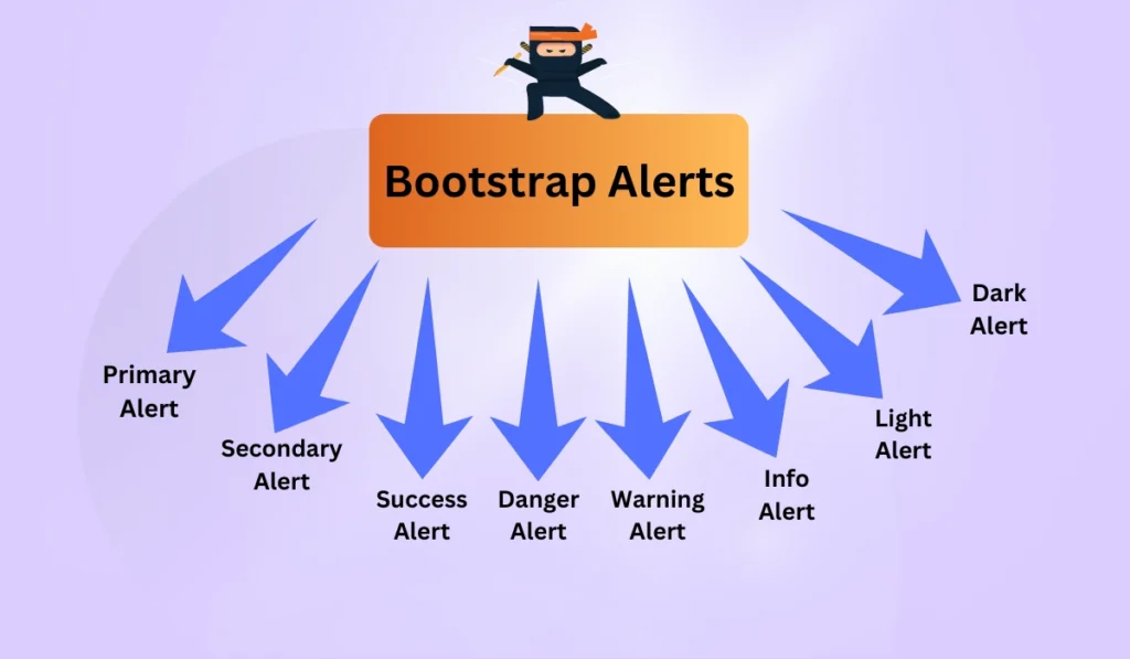
Instead of designing notification boxes from scratch, developers can use Bootstrap’s built-in alert classes. These classes include different styles for different purposes such as success, danger, warning, information, and primary notifications.
A basic alert uses the alert class along with a contextual class. For example, alert-success creates a positive notification while alert-danger highlights an important error message.
<div class=”alert alert-success”>
Your account has been created successfully.
</div>
This simple structure creates a professional-looking notification without additional CSS. Developers can easily integrate these components into websites and applications.
Why Bootstrap Alerts Matter for Better UX
User experience depends heavily on communication. When users interact with a website, they need confirmation and guidance. Without proper messages, users may feel confused or uncertain.
Bootstrap Alerts solve this problem by providing instant visual feedback. They tell users what happened after an action and what they should do next.
- Improves website communication
- Reduces user confusion
- Creates professional interfaces
- Supports responsive web design
- Makes applications easier to use
Smart Trick 1: Choose the Right Alert Type
The first important UX technique is selecting the correct alert style. Every message has a purpose, and choosing the wrong style can confuse users.
For example, success messages should use positive colors, while errors should use attention-grabbing styles. Developers should understand user psychology when designing notifications.
Success Alerts
Success alerts inform users that an action has completed correctly. They are commonly used after submitting forms, completing purchases, or saving settings.
<div class=”alert alert-success”>
Payment completed successfully!
</div>
Danger Alerts
Danger alerts highlight serious problems. They should be used carefully because excessive error messages can create a negative experience.
<div class=”alert alert-danger”>
Unable to process your request.
</div>
Warning Alerts
Warning alerts notify users about possible issues before they happen. They are useful for confirmation steps and important reminders.
<div class=”alert alert-warning”>
Your subscription will expire soon.
</div>
Smart Trick 2: Keep Alert Messages Simple
A common mistake developers make is creating long and complicated notifications. Users usually scan messages quickly, so alerts should be short and meaningful.
A good message explains what happened, why it happened, and what action users should take next.
- Use simple language
- Avoid unnecessary technical words
- Highlight important information
- Provide helpful solutions
For example, instead of showing “Error 503 server response detected”, a better message would be “Our server is temporarily unavailable. Please try again later.”
Smart Trick 3: Add Dismissible Alerts
Some notifications should disappear after users read them. Dismissible Bootstrap Alerts improve user control and prevent clutter.
<div class=”alert alert-info alert-dismissible fade show”>
Information message here.
<button type=”button” class=”btn-close” data-bs-dismiss=”alert”></button>
</div>
Dismissible messages are especially useful for dashboards, announcements, and temporary notifications.
Smart Trick 4: Use Icons and Visual Indicators for Better Understanding
Visual communication plays an important role in modern website design. Adding icons to Bootstrap Alerts can help users understand messages faster. A simple icon can immediately explain whether a message represents success, information, warning, or an error.
Bootstrap Alerts become more engaging when combined with meaningful icons. Users do not always read every word on a webpage, so visual elements improve scanning speed and make interfaces more user-friendly.
<div class=”alert alert-success”>
✔ Your profile has been updated successfully.
</div>
When adding icons, developers should maintain consistency. The icon should support the message instead of replacing important text. Accessibility should always remain a priority.
- Use clear and recognizable icons
- Keep icon size balanced
- Maintain proper spacing
- Never depend only on icons
Smart Trick 5: Make Alerts Responsive and Mobile Friendly
Mobile users represent a large percentage of website visitors. A notification that looks perfect on desktop may become difficult to read on smaller screens. Responsive design ensures that messages remain useful on every device.
Bootstrap Alerts automatically support responsive layouts because Bootstrap follows a mobile-first approach. Developers should still test spacing, text length, and button positions on different screen sizes.
<div class=”alert alert-primary”>
Mobile friendly Bootstrap notification example.
</div>
Good mobile alerts should have readable fonts, enough padding, and clear action buttons. Avoid placing multiple large alerts together because they can overwhelm mobile users.
10 Practical Bootstrap Alerts Examples for Modern Websites
Example 1: Login Success Notification
Login systems require immediate feedback. A success notification helps users understand that authentication was completed correctly.
<div class=”alert alert-success”>
Login successful. Welcome back!
</div>
Example 2: Registration Confirmation Message
Registration pages benefit from clear confirmation messages. Users should know that their account creation process was completed.
<div class=”alert alert-success”>
Your account has been created successfully.
</div>
Example 3: Password Error Alert
Security-related forms need clear error communication. A danger alert can explain incorrect password attempts.
<div class=”alert alert-danger”>
Incorrect password. Please try again.
</div>
Example 4: Website Maintenance Warning
Maintenance notifications help users prepare for temporary changes. Warning alerts are ideal for these situations.
<div class=”alert alert-warning”>
Website maintenance scheduled tonight.
</div>
Example 5: New Feature Announcement
Businesses can use information alerts to highlight new features and updates.
<div class=”alert alert-info”>
A new dashboard feature is now available.
</div>
Example 6: Shopping Cart Message
Ecommerce websites need notifications for product actions. Alerts improve shopping experiences by confirming user activities.
<div class=”alert alert-primary”>
Product added to your shopping cart.
</div>
Example 7: Form Validation Message
Forms require helpful validation feedback. Users should understand what information needs correction.
<div class=”alert alert-danger”>
Please complete all required fields.
</div>
Example 8: Account Verification Alert
Verification messages improve trust and security by informing users about pending actions.
<div class=”alert alert-warning”>
Please verify your email address.
</div>
Example 9: Download Completion Message
Download systems can use alerts to confirm successful file operations.
<div class=”alert alert-success”>
Your file download is complete.
</div>
Example 10: Subscription Renewal Reminder
Subscription-based platforms need reminders to prevent service interruptions.
<div class=”alert alert-warning”>
Your subscription expires in 5 days.
</div>
Best Practices for Creating Effective Alerts
Developers should follow professional design principles when implementing notification systems. Good alerts should provide value, not distraction.
- Write clear and actionable messages
- Use appropriate colors
- Avoid unnecessary notifications
- Test alerts on multiple devices
- Follow accessibility guidelines
Bootstrap Alerts and Accessibility
Accessibility ensures that every user can understand website messages. Developers should consider users who use screen readers or have visual limitations.
Using proper HTML structure, readable colors, and meaningful text improves accessibility. Alerts should communicate information clearly without depending only on color differences.
<div class=”alert alert-info” role=”alert”>
Important information available here.
</div>
Frequently Asked Questions About Bootstrap Alerts
1. What are Bootstrap Alerts?
Bootstrap Alerts are predefined Bootstrap components used to display messages, notifications, warnings, and information to website users.
2. Why should developers use Bootstrap Alerts?
Developers use Bootstrap Alerts because they save development time, provide consistent styling, and improve user communication.
3. Can Bootstrap Alerts be customized?
Yes. Developers can customize colors, icons, animations, layouts, and additional styling using CSS and Bootstrap utilities.
4. Are Bootstrap Alerts mobile friendly?
Yes. Bootstrap Alerts are responsive and work effectively across desktops, tablets, and smartphones.
5. How can Bootstrap Alerts improve UX?
They improve UX by providing instant feedback and helping users understand website actions.
6. Can Bootstrap Alerts include buttons?
Yes. Developers can add action buttons inside alerts for navigation, confirmation, or additional user interaction.
7. Are Bootstrap Alerts good for SEO?
Bootstrap Alerts indirectly improve SEO by improving user experience, reducing confusion, and increasing website usability.
8. Can alerts automatically disappear?
Yes. Developers can create auto-dismiss notifications using JavaScript timers.
9. Which Bootstrap version supports alerts?
Bootstrap Alerts are available in modern Bootstrap versions including Bootstrap 4 and Bootstrap 5.
10. Are Bootstrap Alerts suitable for web applications?
Yes. They are widely used in dashboards, admin panels, ecommerce platforms, and SaaS applications.
Conclusion
Bootstrap Alerts are an important component for creating professional and user-friendly websites. They help developers communicate effectively with visitors and provide meaningful feedback after every interaction.
By following the five smart UX tricks discussed in this guide, developers can create better notification experiences. Choosing the correct alert type, keeping messages simple, adding visual indicators, improving responsiveness, and following accessibility practices will make websites more effective.
Quality web development is not only about writing code. It is about creating experiences that users understand and enjoy. Properly designed notification systems can increase trust, improve engagement, and make websites feel more professional.