
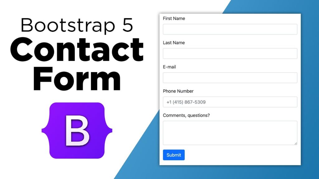

Bootstrap Forms are one of the most important components of modern web development. Whether you are creating a login page, registration page, contact form, checkout process, or customer feedback section, Bootstrap Forms help developers create responsive and user-friendly interfaces quickly.
A well-designed form directly impacts conversion rates, user engagement, and customer satisfaction. Many visitors leave websites because forms are confusing, difficult to use, or not optimized for mobile devices. This is why understanding Bootstrap Forms is essential for developers and designers who want to create professional web applications.
Bootstrap Forms provide ready-made styling, responsive layouts, validation support, accessibility features, and consistent design patterns. Instead of writing extensive CSS from scratch, developers can use Bootstrap classes to build attractive forms in minutes.
In this detailed guide, you’ll learn practical techniques, UX improvements, real-world examples, and best practices that make Bootstrap Forms more effective. By applying these strategies, you can significantly improve usability and increase form completion rates.
Why Bootstrap Forms Matter
Forms are often the primary interaction point between users and websites. Every signup form, login form, survey, booking request, and checkout process relies on effective form design. Poorly structured forms create friction, while optimized Bootstrap Forms encourage users to complete actions smoothly.
- Improved user experience
- Mobile responsiveness
- Faster development
- Accessibility support
- Built-in validation styles
- Professional appearance
- Consistent UI design
Genius Trick #1: Use Proper Form Layouts
The structure of your form affects readability and usability. Grouping related fields together helps users understand information requirements quickly. Bootstrap’s grid system allows developers to create organized layouts that look professional on every device.
For example, placing first name and last name fields side-by-side reduces vertical scrolling and creates a cleaner appearance.
<div class=”col-md-6″>
<input type=”text” class=”form-control” placeholder=”First Name”>
</div>
<div class=”col-md-6″>
<input type=”text” class=”form-control” placeholder=”Last Name”>
</div>
</div>
This approach improves organization while maintaining mobile responsiveness. Users can quickly scan and complete information without confusion.
Genius Trick #2: Add Helpful Placeholders and Labels
Labels provide context and improve accessibility. Placeholders offer additional guidance. Combining both creates a better user experience because visitors immediately understand what information is expected.
<input
type=”email”
class=”form-control”
placeholder=”Enter your email”>
Avoid relying only on placeholders. Labels remain visible after users begin typing, reducing mistakes and confusion.
Genius Trick #3: Implement Validation Feedback
One of the biggest UX improvements for Bootstrap Forms is validation feedback. Users should immediately know whether information is valid or needs correction.
type=”email”
class=”form-control is-invalid”>
<div class=”invalid-feedback”>
Please enter a valid email address.
</div>
Instant feedback prevents frustration and helps users submit forms successfully on their first attempt.
Benefits of Validation
- Reduces form errors
- Improves completion rates
- Enhances user confidence
- Prevents invalid submissions
- Improves overall UX
Example 1: Simple Contact Form
<input type=”text”
class=”form-control mb-3″
placeholder=”Name”>
<input type=”email”
class=”form-control mb-3″
placeholder=”Email”>
<textarea
class=”form-control mb-3″
placeholder=”Message”></textarea>
<button class=”btn btn-primary”>
Send
</button>
</form>
This basic contact form is responsive, clean, and ideal for business websites, portfolios, and service providers.
Example 2: Registration Form
<input type=”text”
class=”form-control mb-3″
placeholder=”Username”>
<input type=”email”
class=”form-control mb-3″
placeholder=”Email”>
<input type=”password”
class=”form-control mb-3″
placeholder=”Password”>
<button class=”btn btn-success”>
Register
</button>
</form>
Registration forms benefit from clear field labels, password guidance, and proper validation messages.
Best Practices for Modern Bootstrap Forms
- Keep forms short whenever possible.
- Use logical field ordering.
- Provide clear instructions.
- Display validation errors instantly.
- Optimize for mobile devices.
- Use descriptive button text.
- Ensure accessibility compliance.
- Use consistent spacing.
Following these practices helps create Bootstrap Forms that users enjoy interacting with and are more likely to complete successfully.
Genius Trick #4: Use Input Groups for Better User Guidance
Input groups are one of the most useful Bootstrap features for improving user experience. They allow developers to add icons, prefixes, suffixes, buttons, or additional information directly alongside form controls. This makes forms easier to understand and reduces the likelihood of user errors.
For example, when asking users to enter a website URL, adding a URL prefix helps clarify the expected format. Similarly, currency symbols can make payment or pricing forms more intuitive.
<span class=”input-group-text”>
https://
</span>
<input
type=”text”
class=”form-control”
placeholder=”yourwebsite.com”>
</div>
This simple enhancement can significantly improve clarity and reduce incorrect submissions.
Advantages of Input Groups
- Improves field recognition.
- Reduces user confusion.
- Creates professional-looking forms.
- Enhances usability on mobile devices.
- Provides additional context for user input.
Genius Trick #5: Optimize Forms for Mobile Users
More than half of modern website traffic comes from smartphones and tablets. Mobile optimization is no longer optional. Responsive Bootstrap Forms automatically adapt to smaller screens, but developers should still follow mobile-friendly design principles.
Large touch targets, adequate spacing, readable labels, and minimal scrolling all contribute to a better mobile experience.
<label class=”form-label”>
Phone Number
</label>
<input
type=”tel”
class=”form-control”
placeholder=”+91 9876543210″>
</div>
Using appropriate input types such as email, tel, number, and date also helps mobile devices display optimized keyboards for faster data entry.
Example 3: Login Form
A login form is one of the most frequently used web components. A clean and simple design improves accessibility and encourages user engagement.
<input
type=”email”
class=”form-control mb-3″
placeholder=”Email Address”>
<input
type=”password”
class=”form-control mb-3″
placeholder=”Password”>
<button class=”btn btn-primary”>
Login
</button>
</form>
Example 4: Newsletter Subscription Form
Newsletter forms are essential for lead generation and email marketing campaigns. Keeping the form short often leads to higher conversion rates.
<input
type=”email”
class=”form-control mb-3″
placeholder=”Enter Your Email”>
<button class=”btn btn-success”>
Subscribe
</button>
</form>
Example 5: Search Form
Search forms help visitors quickly find information. Bootstrap allows developers to create elegant search bars with minimal effort.
<input
class=”form-control me-2″
type=”search”
placeholder=”Search”>
<button class=”btn btn-outline-primary”>
Search
</button>
</form>
Example 6: Feedback Form
Collecting user feedback helps businesses improve products and services. A simple feedback form encourages more responses.
<input
type=”text”
class=”form-control mb-3″
placeholder=”Your Name”>
<textarea
class=”form-control mb-3″
rows=”4″
placeholder=”Share your feedback”>
</textarea>
<button class=”btn btn-warning”>
Submit Feedback
</button>
</form>
Example 7: Event Registration bootstrap forms
Event organizers frequently use bootstrap forms to collect attendee information. Bootstrap makes these bootstrap forms responsive and visually appealing.
<input
type=”text”
class=”form-control mb-3″
placeholder=”Full Name”>
<input
type=”email”
class=”form-control mb-3″
placeholder=”Email Address”>
<select class=”form-select mb-3″>
<option>Select Ticket Type</option>
<option>Standard</option>
<option>VIP</option>
</select>
<button class=”btn btn-danger”>
Register Now
</button>
</form>
Advanced Bootstrap Input Techniques
Professional developers often go beyond basic bootstrap forms fields. Advanced input controls can improve functionality and create a better overall user experience.
- Floating Labels
- Input Groups
- Custom File Uploads
- Range Sliders
- Switch Controls
- Date Pickers
- Multi-Step bootstrap forms
- Dynamic Validation
Using Floating Labels
Floating labels create a modern user interface where labels move above the input field when users start typing. This design pattern saves space and maintains context.
<input
type=”email”
class=”form-control”
id=”floatingEmail”
placeholder=”Email”>
<label for=”floatingEmail”>
Email Address
</label>
</div>
Many modern SaaS platforms and web applications use floating labels because they look professional and improve usability.
Accessibility Tips for Better UX
Accessibility is a critical component of bootstrap forms design. Websites should be usable by everyone, including people with disabilities. Bootstrap provides accessibility-friendly structures, but developers should still follow best practices.
- Always use labels.
- Provide descriptive error messages.
- Ensure sufficient color contrast.
- Support keyboard navigation.
- Use semantic HTML elements.
- Test bootstrap forms with screen readers.
Accessible bootstrap forms not only improve inclusivity but also contribute to better SEO and user satisfaction.
Common bootstrap forms Design Mistakes to Avoid
- Too many required fields.
- Unclear instructions.
- Poor mobile responsiveness.
- Missing validation feedback.
- Overly long forms.
- Confusing button labels.
- Inconsistent spacing.
- Lack of accessibility support.
Avoiding these mistakes helps create forms that users trust and complete successfully.